The Brand
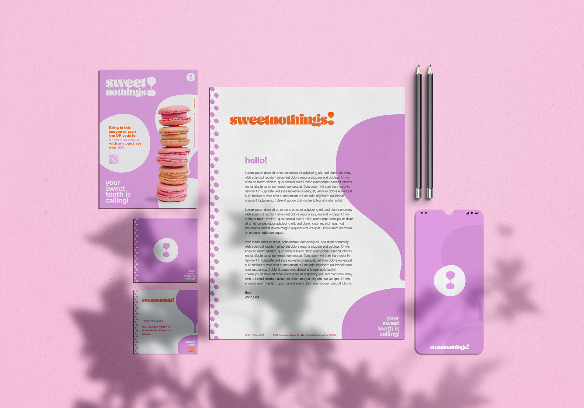
A fast casual dessert bar is the best way to explain sweet nothings!. Being a brand created for Aramark we knew it was going to live in fast traffic places and will be quick dining (if any dining at all). To grab the attention of passersby we wanted the brand to be very eye-catching, while having a quirky and inviting vibe. If the name doesnt give it away alone, the pastel color palette and the tagline ‘your sweet tooth is calling!’ all come together screaming dessert here!
collaboration with Dan Berg at little box inc.

Brand in Use


The Identity
As stated above, sweet nothings! is a dessert brand at its core. We went with a more literal sense of what a dessert brand looks like... Pastel pinks and purples, polka dots and fun typefaces. These elements immediately resonate dessert nostalgia with viewers, which help in the fast pace areas the dessert bars will tend to be in.
The logo-type for sweet nothings is admittedly on trend with the fat funky serif fonts, but with the simple design we think it will stand the test of time. Using the exclamation point from the logo-type as the brand mark just made sense for a brand that is demanding attention and anchoring it in an imperfect circle enforces the fun and relaxed feeling of the brand. To hit the nostalgia factor of desserts, the polka dot pattern is crucial. Polka dots and desserts have always been synonymous with each other and we wanted to maintain that.

Thank You