The Brand
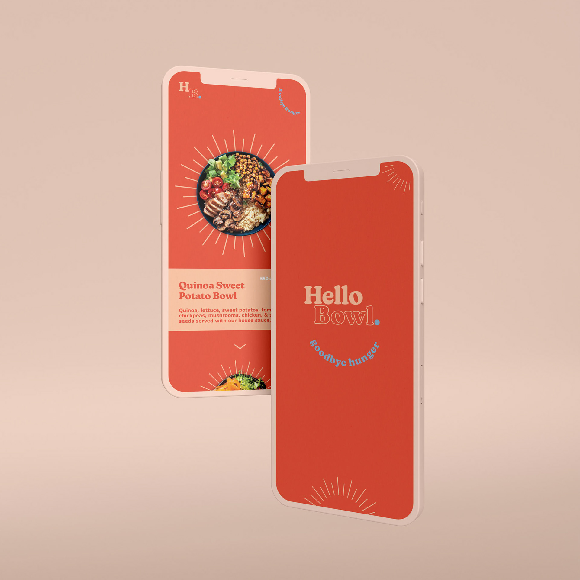
Hello Bowl. A fast casual restaurant that does everything bowls and prides itself using healthy substantial ingredients that taste great. Tasked with naming and creating the identity as a whole, we wanted the focus to be casual and inviting. The name says it all.
collaboration with Dan Berg at little box inc.

Brand in Use


The Identity
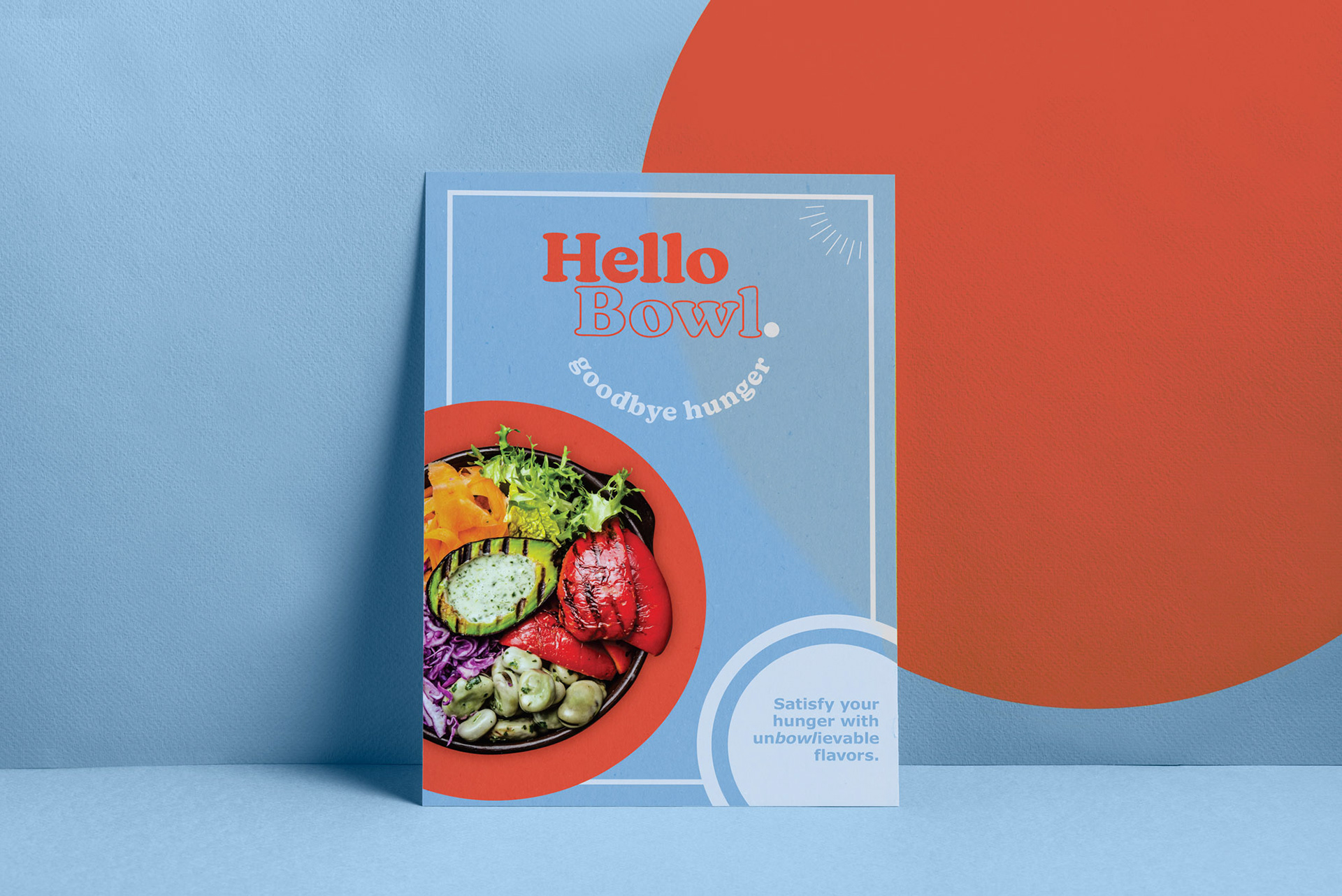
To hit the casual and inviting vibe of the brand it really starts with the name. Hello Bowl. Telling you exactly what they do with a smile. If the name doesn’t get the point fully across, there is a supporting tagline that drives it home.
Kansas New was a perfect typeface for the specific vibe we were striving for. It has playfulness, while maintaining a solid and timeless existence. It was an easy choice to leverage it for the logo-type, taglines and headings adding a cohesiveness to everything.
For the color palette we wanted a few primary colors, this helps for differentiating things like dishes or cuisines. However, the prominent color is Red (Pantone 7417C). The psychology being hunger inducing while having an eye catching pop helps to lure people into the restaurant.
Wanting to show the natural and healthy ingredients curated for each bowl we decided to add food photography to the marketing. We didn’t want to just tell you, we wanted to show you. Overall Hello Bowl. has a simple brand identity, but it gets the right points across where it needs and lets the food do the rest.


Thank You