The Brand
Being one of the first to the sharing economy for cannabis delivery in Colorado (think Uber but for bringing cannabis to your door) Buzz Delivery wanted to make a loud and professional debut. To Buzz Delivery founder Matt Marshall, cannabis and social equity are deeply personal, so he had one mission in mind: to elevate and support the Colorado cannabis community.
In initial talks, I was moved by Matt and his urge to use the platform to push reparative justice for people with past cannabis charges, and uplifting the community by providing work for the people who need it most.
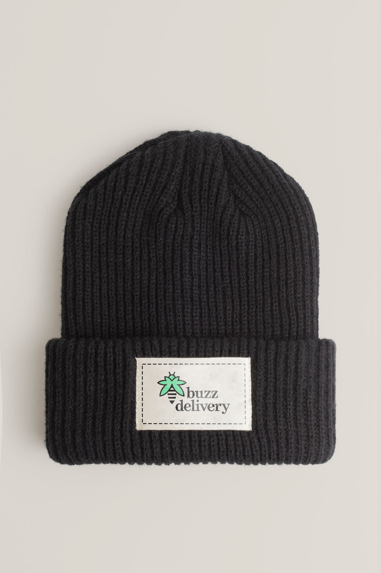
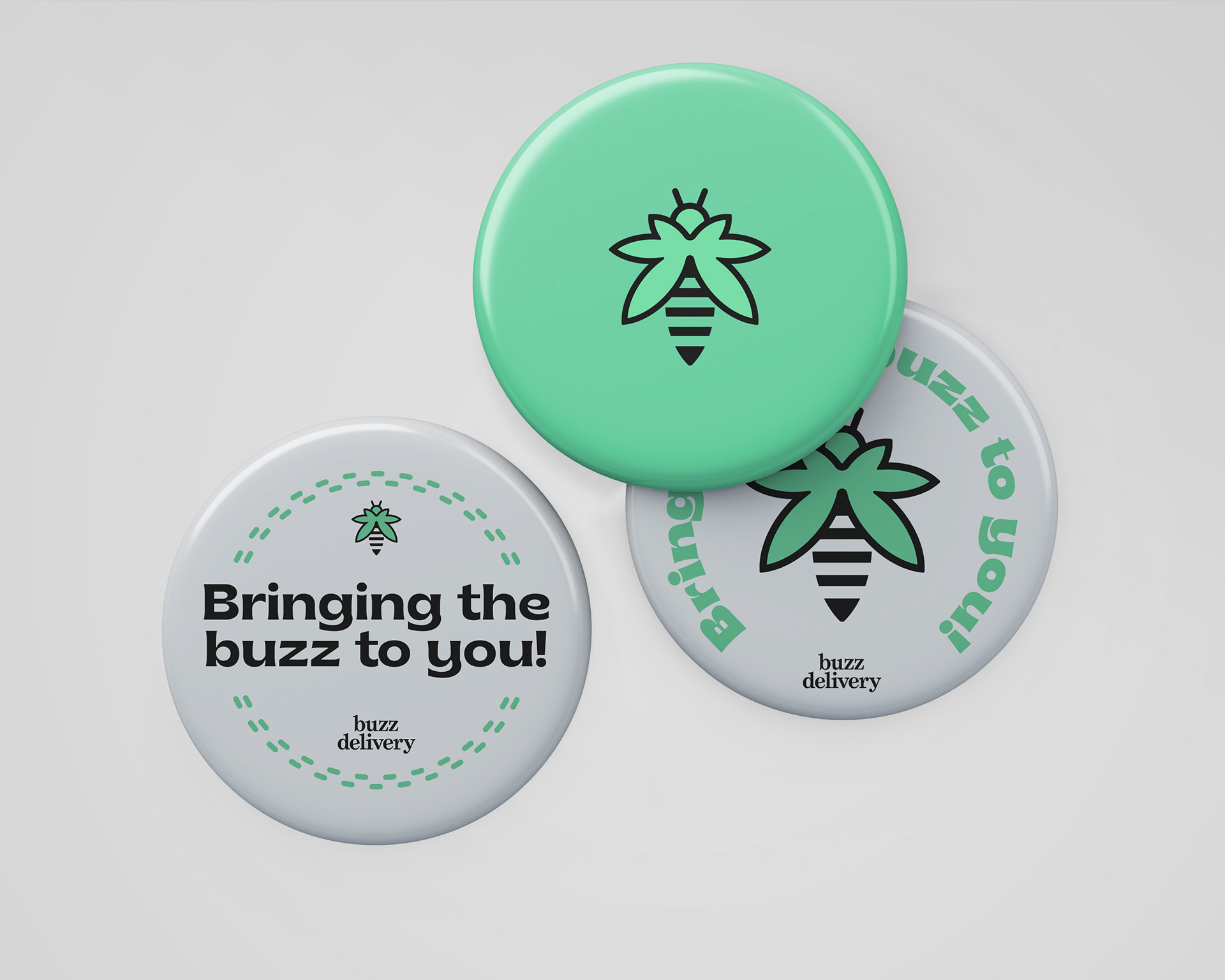
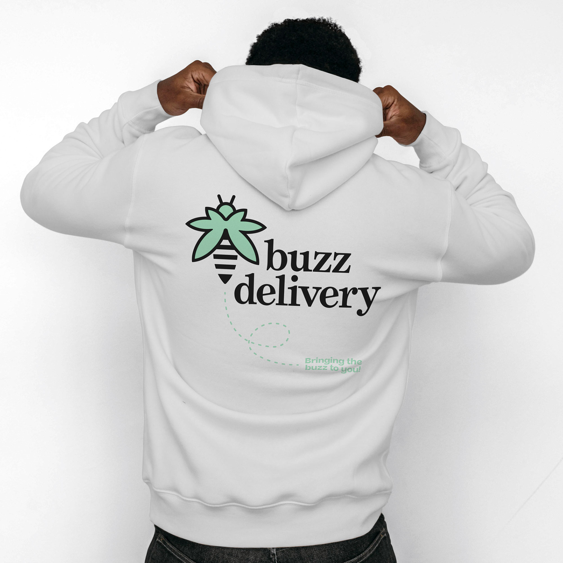
Brand in Use


The Identity
With the name Buzz Delivery, the client wanted to incorporate a bee while still conveying that cannabis vibe. The silhouette of a bee, if splayed out, roughly resembles a cannabis leaf. Transforming the silhouette accordingly and adding stripes the connection is easily made between the two. Deciding to use the bee as the prominent feature of the logo-mark while the cannabis leaf being a more ‘aha’ moment when you flip it, we wanted to have an additional connection to the cannabis side.
To push the connection we went with a pastel green as the main color. While adding a natural and calming vibe to the brand. Using a dark gray to compliment the green brings in a rich contrast to the designs while maintaining the natural aesthetic. Thinking towards the future, we decided to extend the palette for the secondary colors. This gives future products/packaging/promotions a defined set to play with for differentiation while staying in the buzz delivery identity.
To portray the brand as trustworthy, professional and inviting, we set the logo-type in an all lowercase serif font. This plays off the more playful nature of the logo-mark giving you a well rounded display of the brand. This being a cannabis brand at its core we had to bring in some fun to the typefaces as well, and that is where Brice comes in. This display typeface is used for taglines, and headlines for most uses, but it can also look really nice for body copy in certain occasions.
For the additional graphic elements, we decided to keep it more reserved. Using different dotted lines to communicate the delivery/travel aspect of the brand. The stripe pattern was a more literal play off the bee to use sparingly.
Thank You


