The Brand
Nakiri is a restaurant created by Aramark that specializes in the Asian-American cuisine. I was tasked with coming up with the brand as a whole, from the name to the identity. Knowing that the restaurants will be set up in heavy movement areas such as airports, hospitals, colleges, etc... We wanted to design something that immediately conveyed the Asian-American influence. From the name, brush lettering of the logo and straight to the point 'Sushi, Ramen & More' tagline, it all resonates immediately.
collaboration with Dan Berg at little box inc.

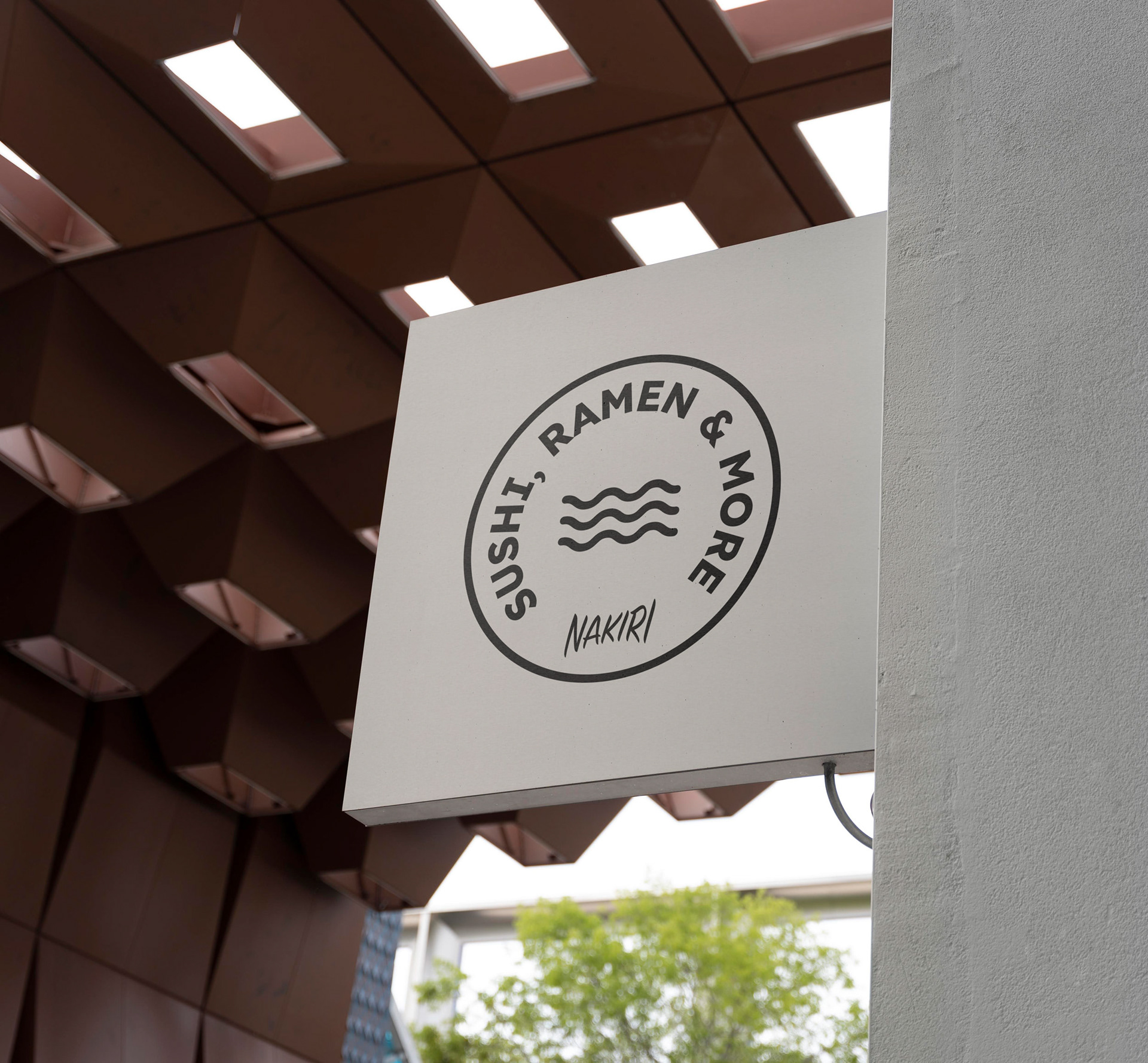
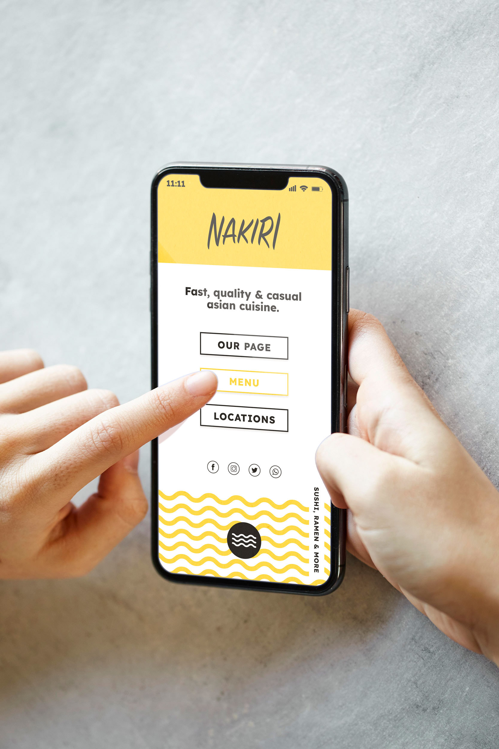
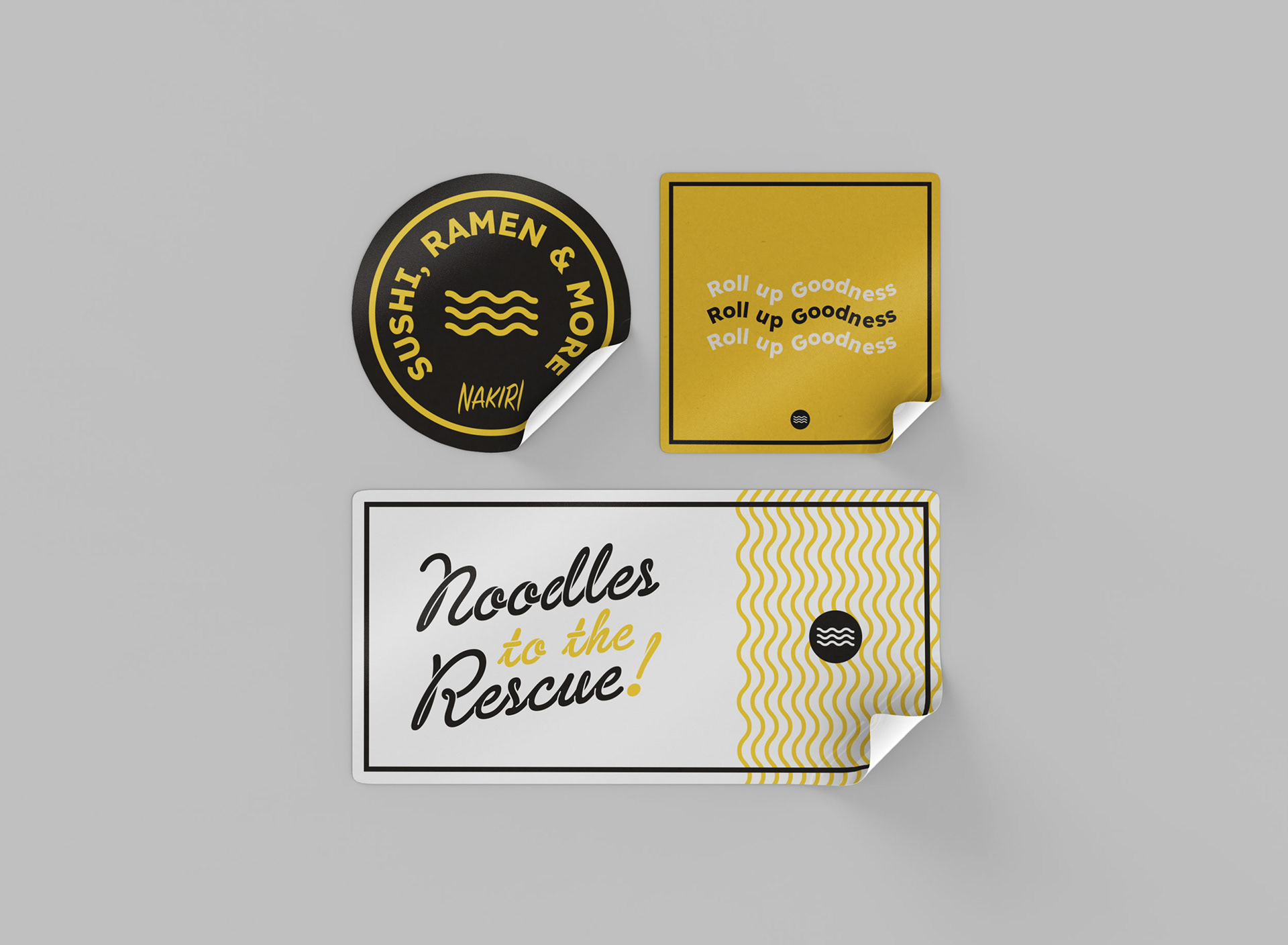
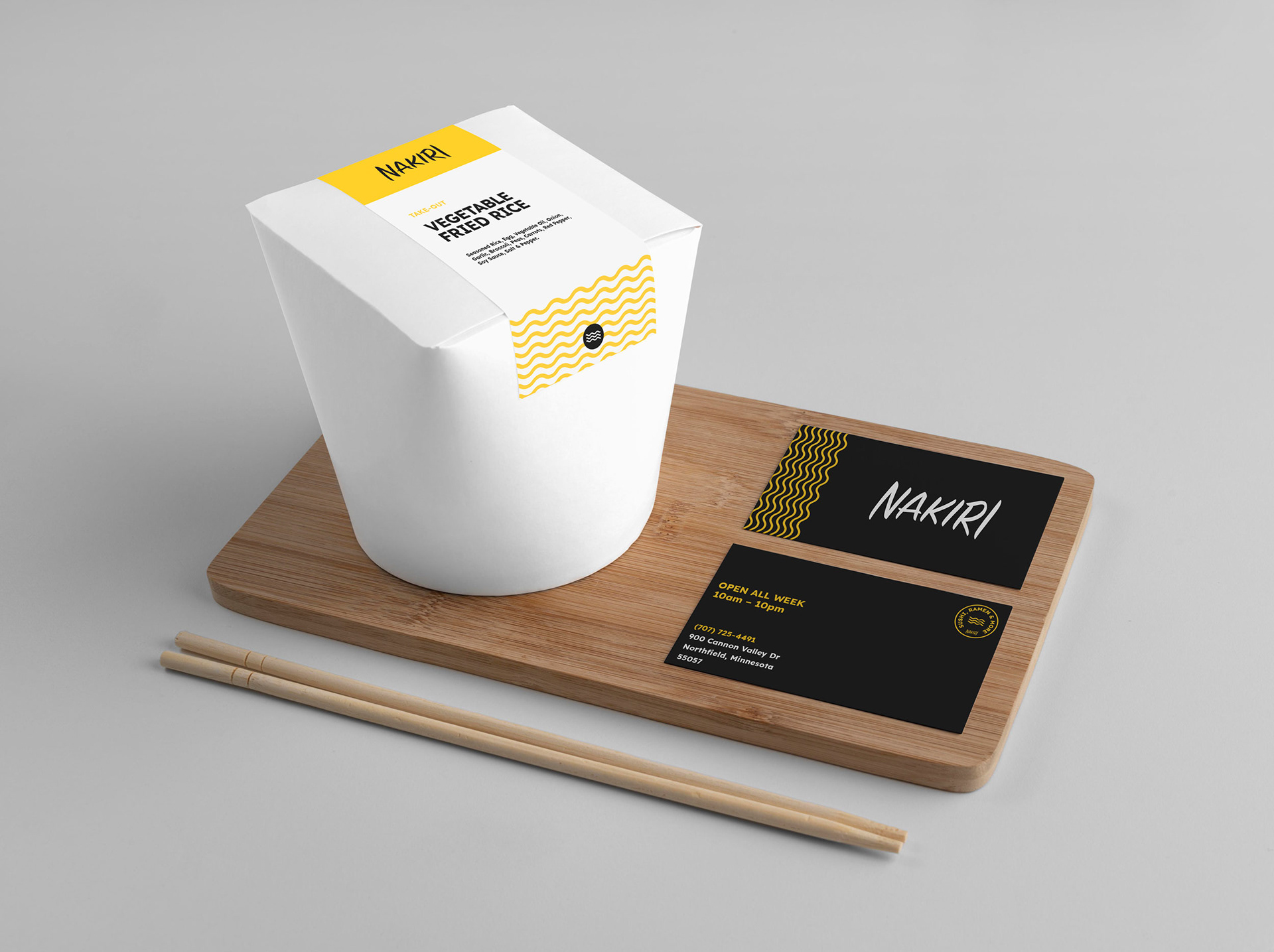
Brand in Use


The Identity
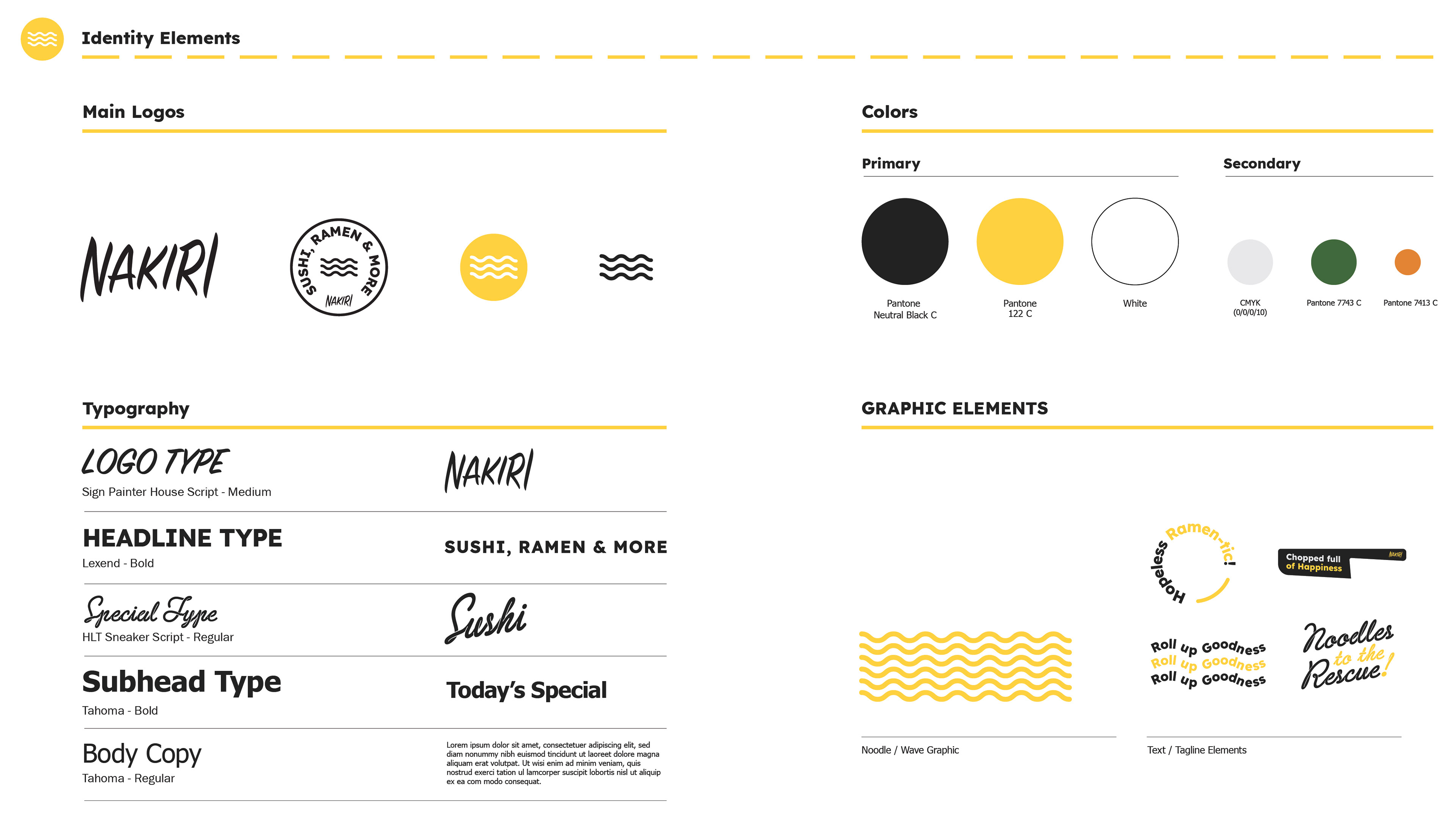
As a whole, Nakiri needed to convey Asian-American cuisine immediately. We accomplished that in a few different ways. Starting with the name, Nakiri is a widely used Japanese knife, and it has a very sharp ring to it making it a great name for a restaurant. By hearing the name alone you can assume pretty confidently that it’s a food place of some sort.
With the logotype, we consciously went with a brush font knowing the history of Asian culture and the use of the brush in calligraphy. To offset the more organic forms of the brush logotype, we used a bold San-serif with a little bit of character for the taglines and headlines.
Using waves as a logo mark and brand element was pretty intuitive. The audience can quickly make the connection to the various noodle dishes Nakiri specializes in. The wave element goes further by adding a modern flair to graphics while threading the brand together in a cohesive way.

Thank You