The Brand
Main Ingredient is a restaurant created by Aramark that delivers on typical American dining in a more upscale fashion. We designed this brand to enforce the natural and simple ingredients used. If the minimal design doesn’t say that, the taglines will.
collaboration with Dan Berg at little box inc.

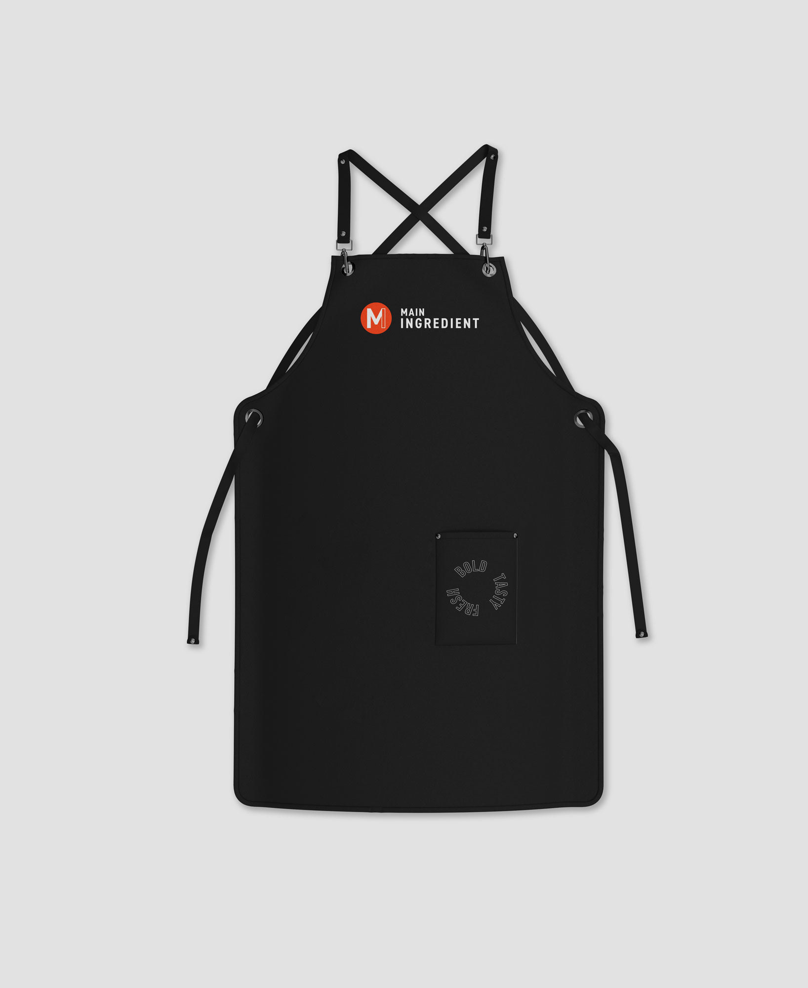
Brand in Use


The Identity
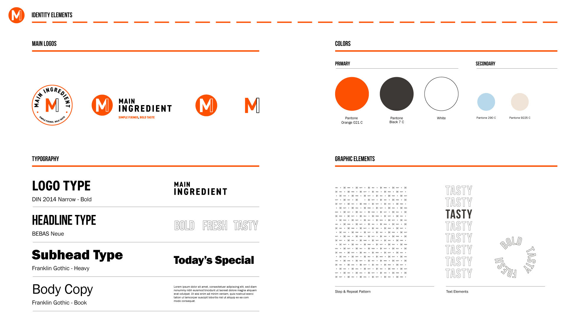
Minimalism was the direction for Main Ingredient. That starts with the logo. Being able to use a single letter ‘M’ to encapsulate the ‘M’ & ‘I’ of Main Ingredient was a winner from the start. Using Din Bold for the logo-type and logo-tagline enforced the minimal aesthetic but helped to add a little more prominence to the brand.
Further accentuating the minimalism, we only used san-serif type. The client wanted to type pop-up menus & specials on their own so we incorporated the Franklin Gothic for them to leverage (being a typeface built into Microsoft applications). This does add three different san-serif typefaces throughout the brand but when used sparingly (no more than two on the same piece) the aesthetic still worked well when following the templates supplied.
While remaining minimal, we still needed some more eye-catching elements to the brand. Bright orange accomplishes that, with the stipulation to never put orange on black staying away from Halloween vibes we were able to hit the mark we wanted.
Additionally pushing the bold, tasty and fresh talking points, we added some typography graphic elements and simple motion graphics to layer into marketing. Mainly sticking to outlined type, the added elements would support the main content nicely without overtly intruding.

Thank You